After buying an Apple Watch, I couldn't help but feel like I wanted something less invasive.
I loved the idea, but in practice, it just felt like another device competing for my attention-- so here's my attempt at something just for me.
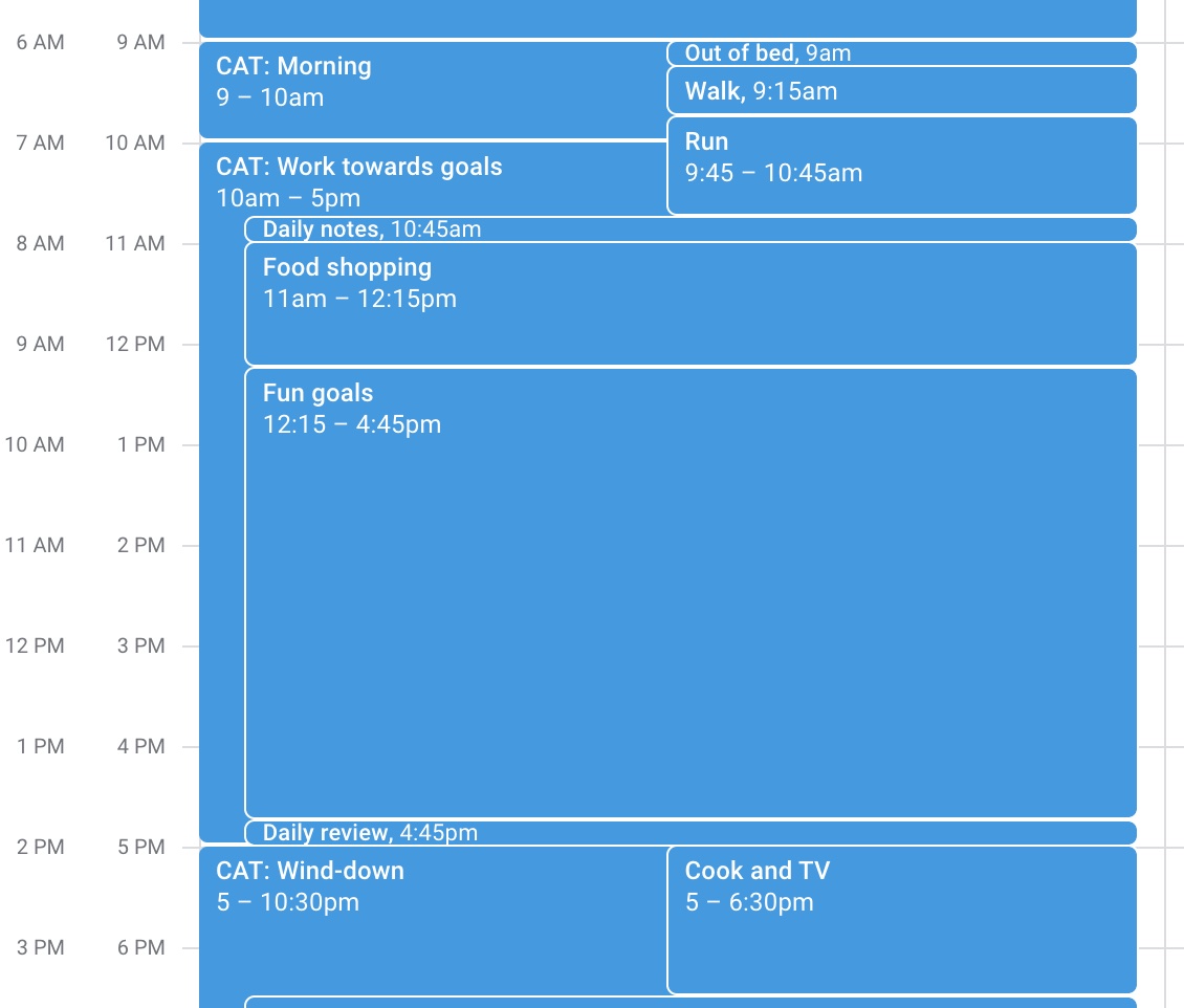
EDIT: For clarity, I don't really timebox like this, everything in that video is a mockup.
I'm still working on a final version with custom hardware. I've never fabbed a board before, and small form-factor projects like this seem like the perfect motivation to learn.
Anyway, join me on this humble adventure to build a fun toy 🙂 and I also tried an E-Ink version based on the Watchy, I show at the end.
Prototyping
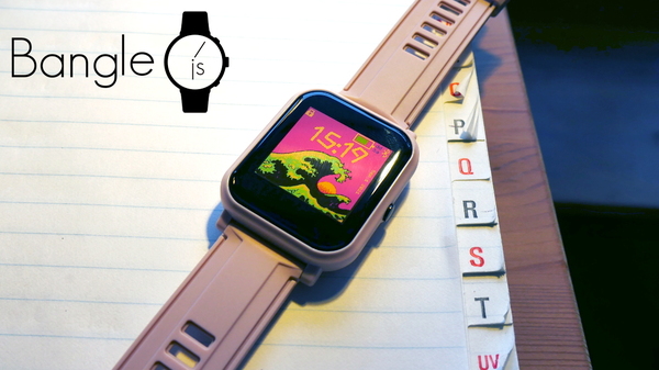
For prototyping, I'm using an open platform called Espruino. The watch I'll be using is the Bangle.js 2.

For me, this prototype was about discovering UX patterns, so let's talk about the original design, and what I plan to tweak in the final version.
Prototyping: design
I've always loved the idea of using a smart watch to keep track of meetings and plans, but I always thought they were super distracting. Even the Apple Watch, which has amazing UX overall I think, felt super invasive.
The design is minimal, time-focused, and features a tight Google Calendar integration.

This is what I try to do on Saturday. These timeboxes are populated into the watch display using a companion app on your phone.
Overall this prototype has:
- Clock + day of month, name of day, and name of month.
- Google Calendar integration to display upcoming events and time blocks.
- Vibrations to notify you of event changes and midpoints.
- Swipe-up for a break timer.
- Sleep mode.
I used this for a few months, while taking a few notes on what I wanted to improve. Because of what I learned, the next version of the watch will have a totally different UX.
Let's talk about what I learned from the prototype.
Prototyping: The good
The Bangle.js 2 has amazing hardware.
After using the Bangle.js 2, I almost don't want to make my own device. The battery life is insane (4 weeks!), and the whole package looks very professional.
The always-on, transflective display is perfect for a time-focused smartwatch. I want to use a similar display in my watch-- I have a brief adventure into E-Ink displays at the end of this post, but for a few reasons they aren't practical right now.
Break timers are amazing.
The swipe-up for a quick break is great. If I ever wanted to just hang out for a little, I could swipe up, and get an easy 5 minute break.
The UX is really good.
I was super happy with the UX after using it. I think it's just the right information to present-- probably couldn't do any better or worse with the screen real estate available.
Prototyping: The bad
Aggressive timeboxing is just no good.
After using the prototype, I learned timeboxing is actually pretty insane. I don't think it's a productive way to schedule your day.
From this, I decided to focus more on a "todo list" style of tracking with the second version of the watch.
Text is hard to read.
The transflective display is amazing in sunlight, and the transflective technology has no intrinsic issue with legibility.
However, the low resolution display made it hard to read text. I went two-tone text, with white foreground and red background, that I think is very pretty-- but the red drop shadow actually makes it difficult to read.
Next steps
So, after a few months of using the prototype, the main take-away from the UX side was that timeboxing is actually not so great. I'm just not able to stick to the pre-planned timeboxes at all, even after weeks of practice with the prototype.
For a quick shortlist of changes in the next prototype:
- Todoist integration: Show todoist tasks as auto-scheduled timeblocks.
- Delay/end tasks: Swipe right to delay task, swipe left to complete task.
- Punt task: Punt a task I don't want to do, and reschedule it for later.
This will all live alongside the existing Google Calendar integration, so my pre-scheduled events/meetings will take priority, and then my todoist tasks will just be scheduled in there automatically.
Bonus: E-Ink version
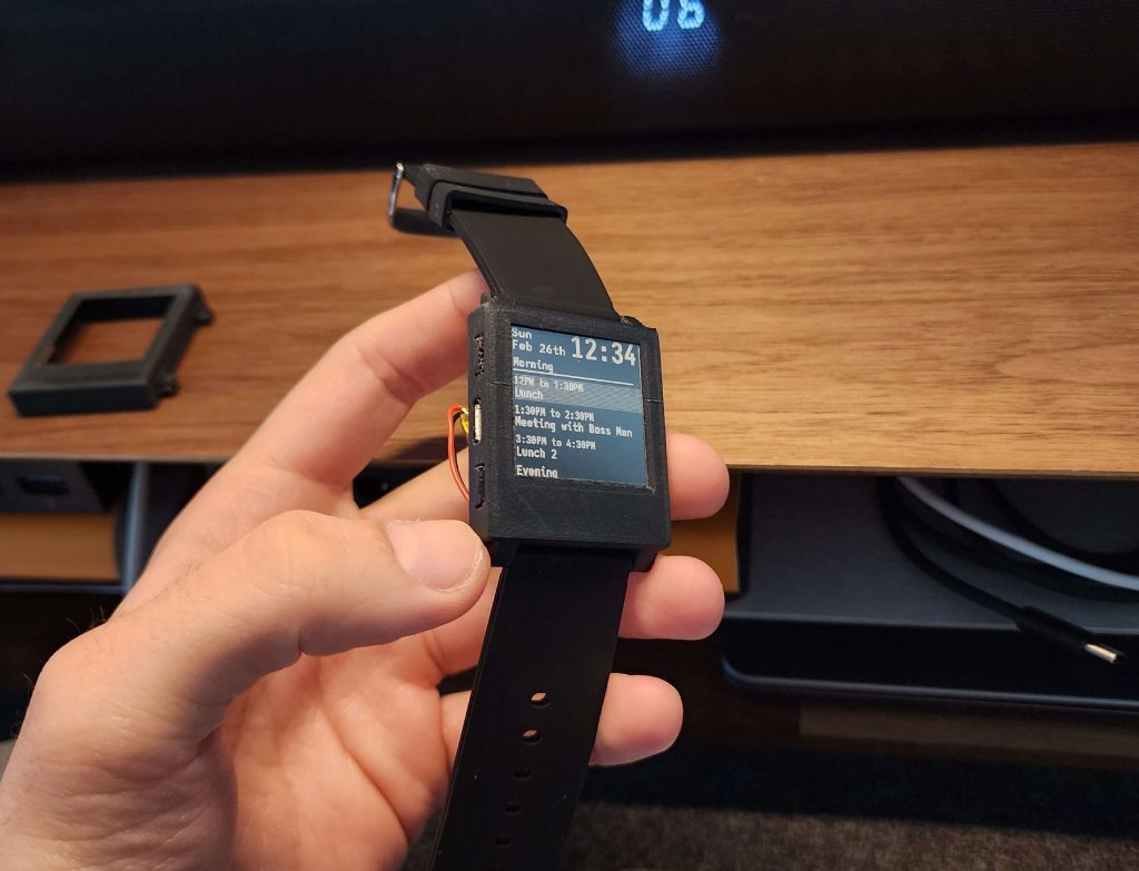
E-Ink is literally my favorite display tech of all time, so I made an E-Ink prototype too. This was based on the Watchy by SQFMI, and it was really beautiful.

I actually had to cut up the PCB to get it in this case size, so it's probably one of the smallest Watchy cases out there. The watchface was written using C, I think. I can't remember.
The main reason I didn't go this route was because the screens available for E-Ink displays in this size are so inconvenient, and I hate the chin on the display. Plus, they're super expensive.
Anyway, I learned a bunch. Stay tuned 🙂 In the next version, I'll fab my own case and board.